The New Era of Typographic Design: Microsoft's New Default Font

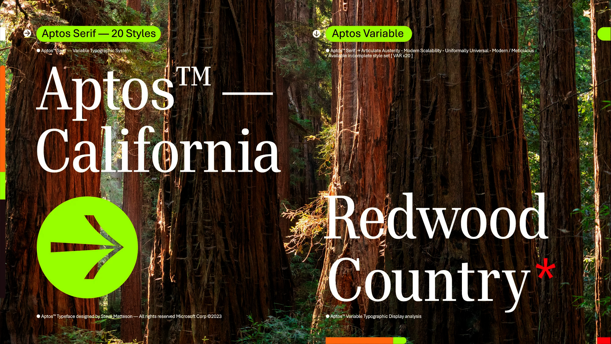
Typography, frequently an underappreciated digital design component, has gained prominence as Microsoft, a major technology company, makes a big change to its default font. This new typeface replaces the venerable Calibri, signifying a significant shift in typographic design.
It signals the start of a new era by reflecting user needs and digital age aesthetics. The specifics of this modification, its effects, and any potential ramifications for the development of digital typography and user experience are all explored in this article.
Historical Overview
For a long time, Microsoft has played a significant role in influencing digital typography. Times New Roman served as Microsoft Word's default font in 1992 while capturing the period's typographic design. But in 2007, Microsoft switched to a more contemporary strategy and replaced it with Calibri.
This sans-serif font's gentle, rounded curves reflected a more modern design that complemented the decade's emerging digital aesthetic. Calibri quickly established itself as the standard for digital documents, becoming well-known to users everywhere. This historical context provides the necessary context for comprehending Microsoft's most recent typographic innovation.
Impact & Response to the New Default Font
After 15 years of usage, Calibri will be replaced by Aptos, the new default font for apps like Word, Outlook, PowerPoint, and Excel. Microsoft's worldwide user base has reacted indifferently to the change in default font. The new font's sleek, contemporary form has received accolades for accurately capturing modern digital aesthetics. Particularly designers value the focus on readability & adaptability across various platforms.
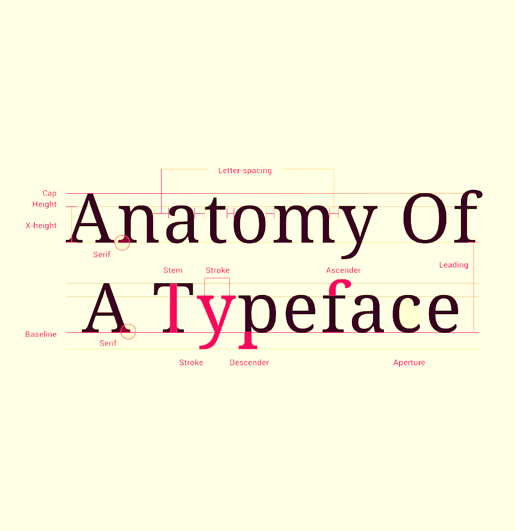
Some users, however, express nostalgia for Calibri since they have gotten acclimated to its appearance and feel over time. The effects of this transition are clear, notwithstanding the variety of responses. It denotes a substantial advancement in typographic design, in line with the changing digital environment & user requirements.
Looking Forward
We may anticipate additional developments in typographic design as we enter this new era that prioritizes user experience and digital aesthetics. The switch to Microsoft's new default font indicates a larger movement toward straightforward, readable, and platform-neutral design.
We should expect a growing emphasis on typography that improves readability and expresses company identities in the future. This alteration paves the way for more inclusive & user-centric typographic patterns, emphasizing the growing importance of type in digital design. Therefore, the future of typographic design appears bright and interesting.
Wrapping It Up
The change in Microsoft's default font heralds a new era in typographic design. This choice of Aptos, which replaces the venerable Calibri, considers modern user demands and digital aesthetics. The change has drawn conflicting responses; some people applaud the contemporary design of Aptos for being readable and flexible, while others express nostalgia for Calibri.
The adjustment highlights how typography's function in digital design is evolving, leaning toward simplicity, readability, and platform adaptability. It paves the way for the next developments prioritizing user experience and strengthening brand identities. Future typographic design developments look interesting.
